

One library,
every screen Torch ships.
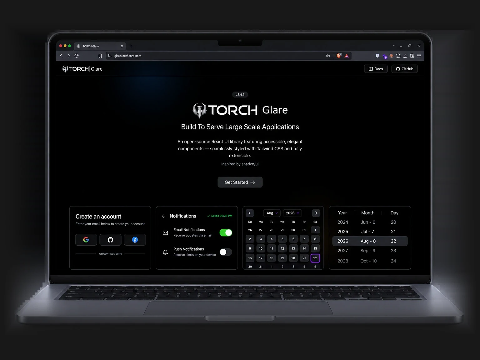
An open-source React UI library featuring accessible, elegant components — seamlessly styled with Tailwind CSS and fully extensible.
npx torch-glare@latest initA design system with a front door
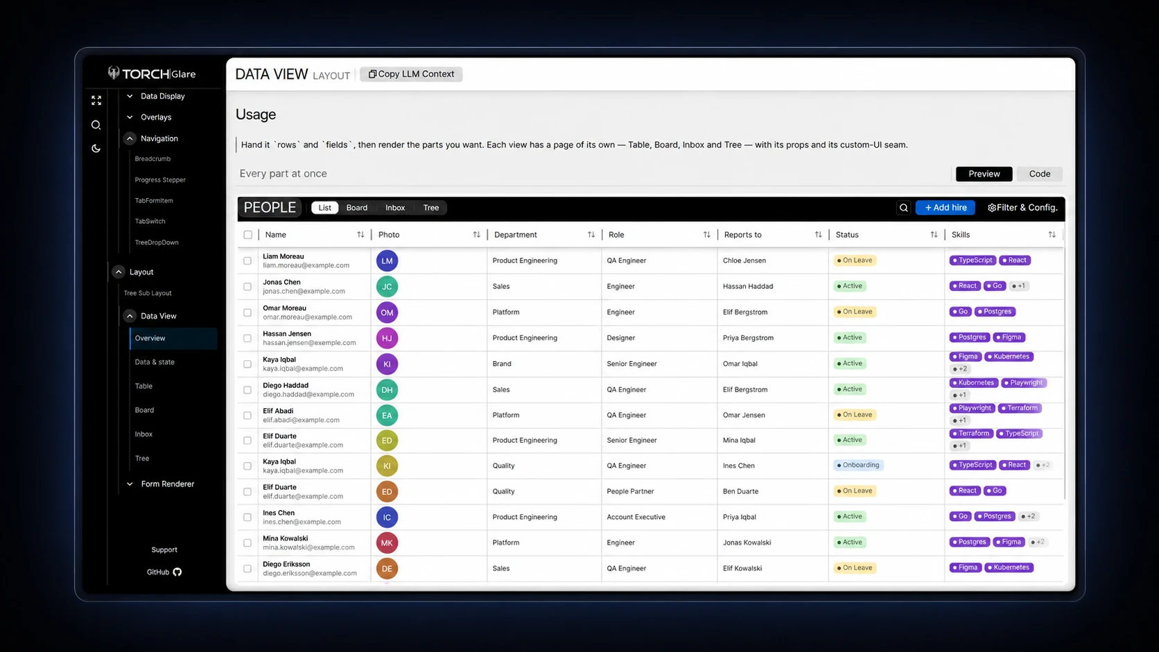
Glare is TORCH’s open-source React component library, built to serve large scale applications and inspired by shadcn/ui. Its documentation site covers every component — buttons, inputs, calendars, tables and the Data View layout that renders the same records as a table, board, inbox or tree — each with a live preview, the source behind a Code tab, and a Copy LLM Context button that hands the whole spec to an assistant.
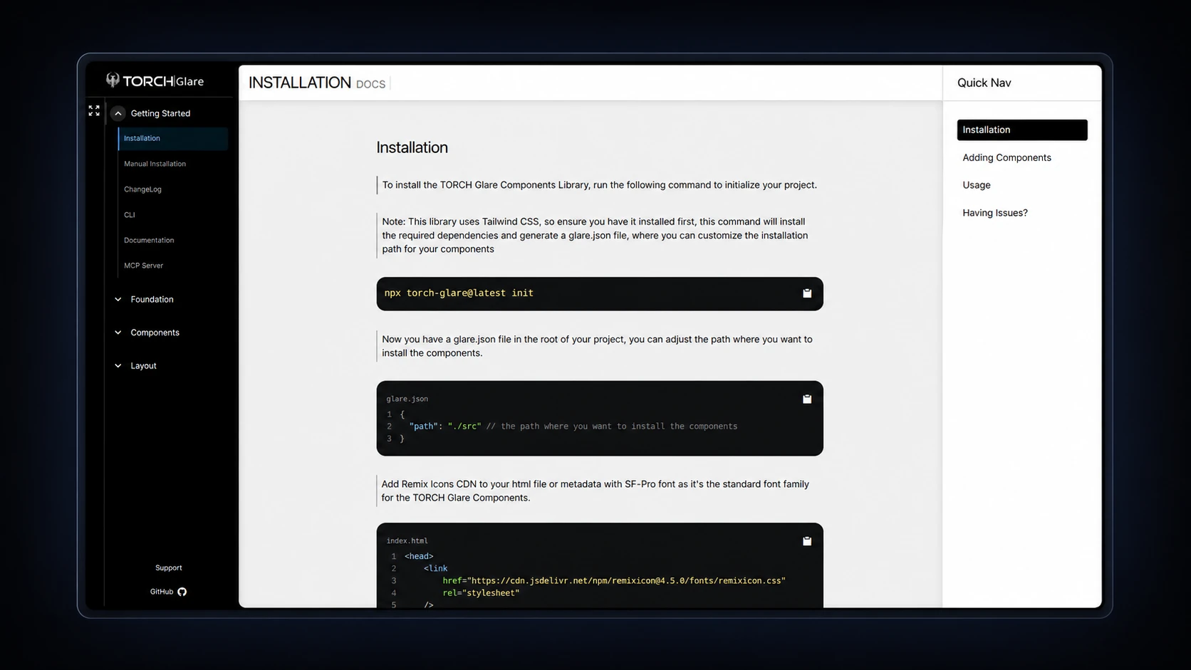
One command, then it is yours
Components are copied into your source tree, not imported from a package — so a team owns and edits them.
npx torch-glare@latest init{
"path": "./src"
}Needs Tailwind CSS, the Remix Icons CDN and SF Pro.
The inventory
Four of the groups on the docs sidebar. Forms, Inputs & Fields and Overlays carry their own beneath these.
- ActionButton
- ActionsGroup
- Button
- ButtonGroup
- LinkButton
- ToggleButton
- Avatar
- Badge
- Calendar
- Card
- HeaderBar
- SectionBlock
- CountBadge
- Divider
- Skeleton
- Table
- SearchableTable
- TextEditor
- Timeline
- Breadcrumb
- Progress Stepper
- TabFormItem
- TabSwitch
- TreeDropDown
- Tree Sub Layout
- Data View
- Form Renderer
Five headings, every page
Overview, Features, Installation, Usage and API — in that order, on every component.
Installation
The CLI writes a glare.json and drops the components into your own source tree.
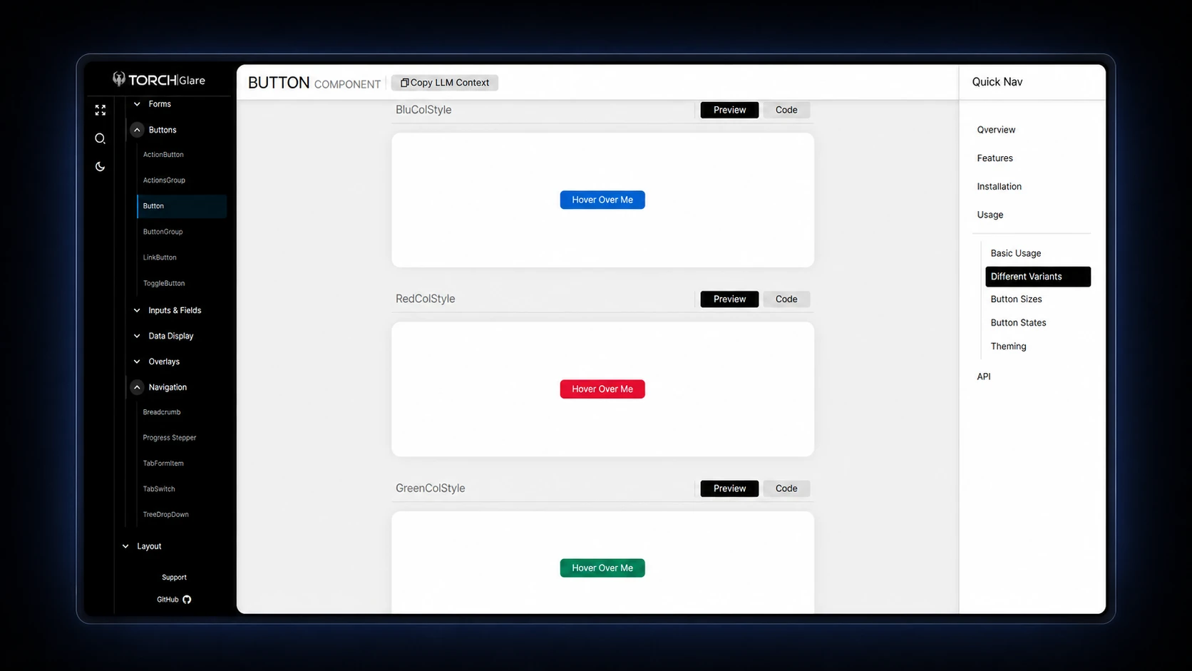
Button
Every variant gets a Preview and a Code tab, then sizes, states and theming.
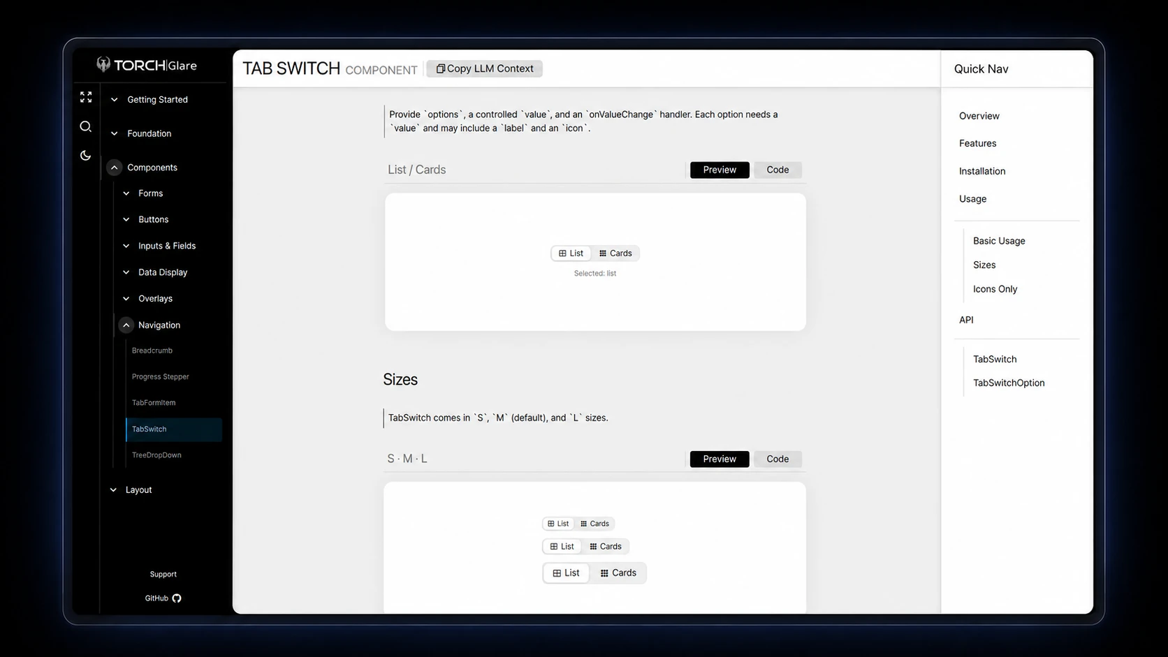
TabSwitch
“Provide `options`, a controlled `value`, and an `onValueChange` handler.” Ships in S, M and L.
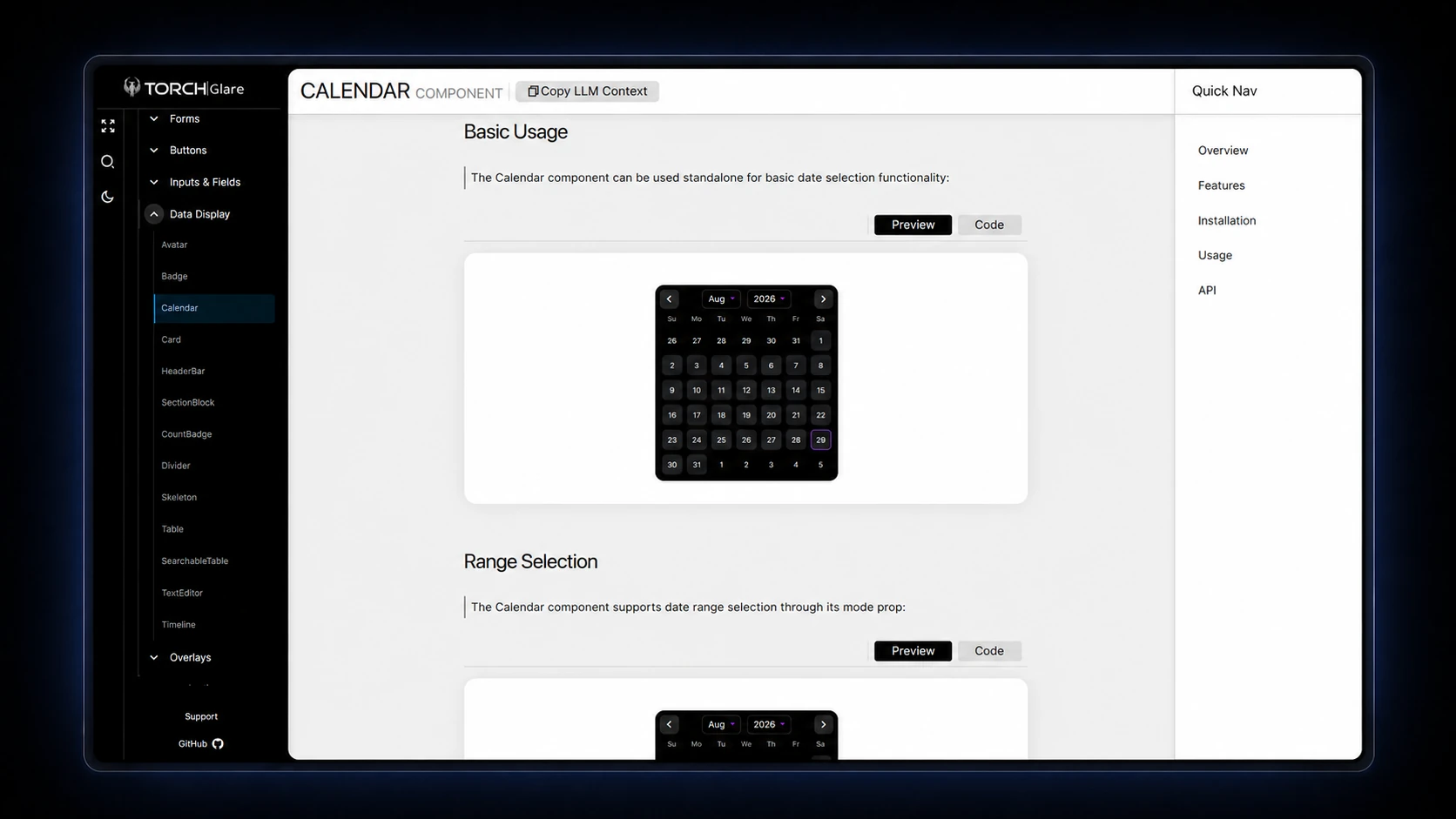
Calendar
Standalone date selection, then ranges through its `mode` prop.
Data View
One set of rows rendered as a table, a board, an inbox or a tree.
What I did on it
The component set
Buttons, inputs, overlays and navigation, up to a Data View that renders one set of rows four ways.
The documentation site
Every component gets the same five headings and a live preview beside its source.
The CLI
One init command installs components into your source tree, so a team edits them rather than wraps them.
Built to be read by assistants
A Copy LLM Context button on every page, and an MCP server in the docs.
Ali is a core part of our team at Torch. From the Glare library to full client platforms, he ships clean, reliable work across web, mobile, and TV, and keeps raising the bar for everyone.